When it comes to creating a course in Moodle, we often focus on the outcomes we need to cover and the assessments we want students to complete. And while these two aspects are important, there is another missing factor: the design of the course.
The Financial Times famously commented on the design of big online courses as … so boring you will have ‘blood pouring out of your eyes’. (quote)
The research also points to the need for well-designed, visual courses. In a recent study by Articulate, nearly 40% of learners found their courses boring. Other research points towards gamifying, with 89% responding they would be more engaged if their online course had a point system and was more game-like.
So how can you design your courses to be more visual, creative and engaging to the learner?
Here are 12 hacks to supercharge the design in your courses.
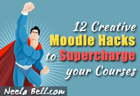
1. Make your course logo compelling
The logo at the top of your page is the most looked at graphic in the entire course … and the individual elements can be repeated in different places on the page. Have fun with the design! Make it eye catching.
![]()
In the logo above, I used images from 123rf.com as well as two playful fonts from dafont.com.
How to guide: How to Make an Awesome Course Logo. (Step by step guide for beginners)
2. Choose bright modern colors
“Color makes a design come alive. It can attract attention, set a mood, and even influence our emotions and perceptions.”
It is also an instant indicator of how dated your course is.
Here is an amazing set of colour combinations from Canva to use when picking colours in Moodle.

Notice that the set contains complimentary colours. These are good when choosing topic colors and the “hover” cover that appears when you place you mouse over top. And speaking of topics …
3. Use Collapsed Topics to keep the course tidy
If you haven’t installed the Collapsed Topics plug in do it right away. It is so much cleaner than the scroll of death in Moodle courses. As mentioned above, they are completely customizable for color, text and left/center placement.
4. Avoid dated graphics
Images and other visuals have a lifespan. That animated gif of the dancing smiley face may have been cute back in the 90’s … but it has to go. The Canva Design School is a fantastic place to get a sense of what modern graphic design looks like. Just wander around.

Check out: 14 Great Tools for Creating Infographics and Images.
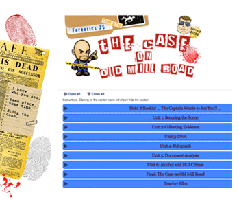
5. Use the Random Glossary block creatively
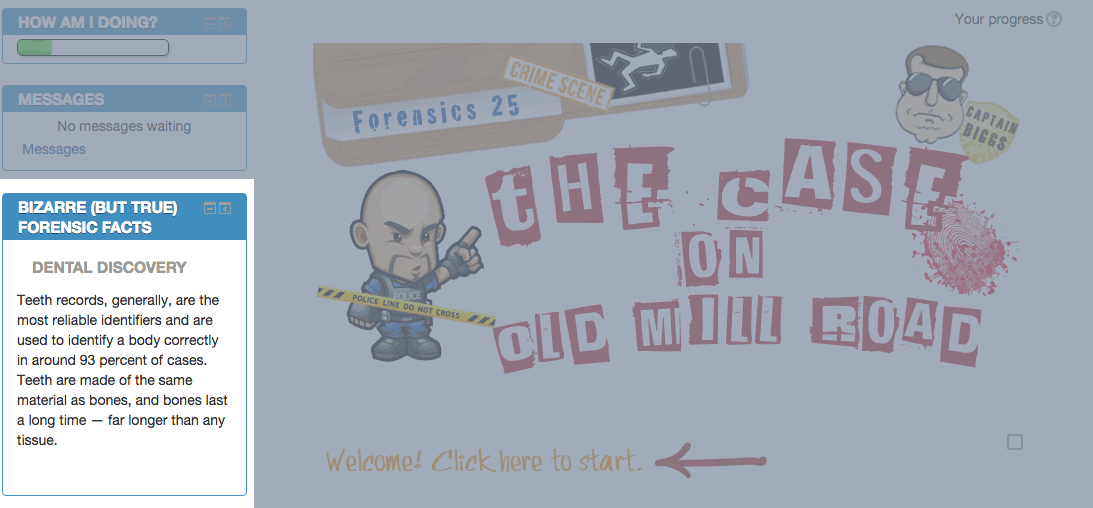
The Glossary block sits on the Moodle sidebar, and is often just used as a dictionary for vocabulary in the course. It is so much more fun if you think outside the box.
The Glossary block will pull a new entry every time the page loads. In other words, every time the learner visits the page it looks different.
In the photo above, you can see the Glossary displayed random (funny and bizarre) forensic facts. Several of the entries also contain pictures (fingerprints, blood stains, etc). It adds visuals to the main page without cluttering up the design.
Other Glossary ideas:
- Famous scientists, animals, little known facts, movies relating to the topic
- Quotes (grab Memes off Pinterest)
- Photo Galleries (Students can even create the entries)
- Avatars … Great for gamified courses
- Student Bio’s … spotlight students and introduce them to one another
- And yes, vocabulary for the course.
If you aren’t sure how to set up a Glossary block this video will show you how.
6. Pull learners along with labels
Labels are little gems. Usually they are used to indicate “UNIT ONE EXAM” or other simple text. Again … you need to think outside the box. They can hold anything … an image, youtube video, or even a song.
The key to making labels magic is to use the Restrict Access setting. This means you can make the label invisible until the learner does something you want.
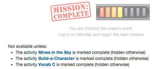
In the above example, the learner doesn’t get to see the “Mission Complete” label until three activities are marked complete. When they ARE marked complete, the label appears in the course. In this example there is a reward message and a progress bar.
I get amazing results in courses where I add progress bars, and labels are the easiest way to do it. Just grab a set of progress bar graphics and put each one in a label. Use them as motivators in your course.
7. Add an RSS feed to the sidebar
 The RSS feed is just a little plug in for your sidebar that grabs headlines from your favourite online news sources and pops them in the course.
Because the newsfeed is “live” you will need to choose an appropriate news feed for the age of your learners.
There are literally thousands to choose from. It doesn’t have to be a news website. Any place that publishes regularly will have a feed, including:
- news and current events
- blogs
- magazine sites
- websites for sports, cooking, technology, crafts, etc.
There are many reasons to use RSS feeds in a course, but the top two are
a) Your course stays current.
b) They are a source of content.
Ask students to respond to something in the feed. Terrific for current events.
This video will show you how to add one to your course.
8. Reduce the text and make it more visual
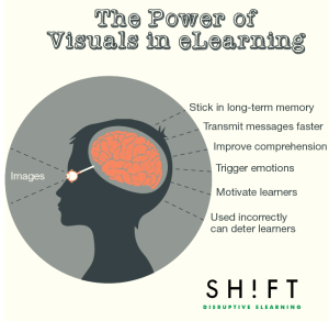 Image from Shift Elearning: Article

According to research, visual information is processed about 60,000 times faster than textual information.
Probably the #1 thing you can do to supercharge your course is to get rid of the text that is making it too bulky and long. Use slideshares, music, podcasts, videos and screencasts to replace long text blocks. Edit like crazy.
Explore ways of demonstrating ideas visually with sketchnoting. Start here, and then have fun with this.
9. Embed a Twitter feed
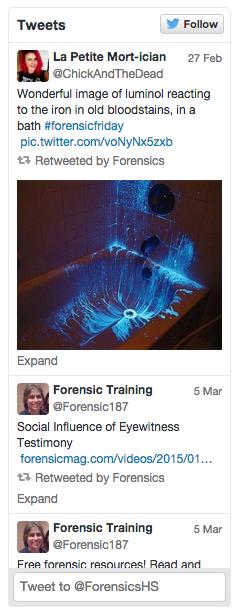 Twitter feeds are similar to RSS feeds in that they pull the latest posts into your sideblock. Tweets generally contain links to pictures, articles and other content that the author thinks is valuable.
Obviously, you will have to be careful which Twitter feed you use!
I started my own Twitter feed (see photo on right), and embedded that into the course. That way I have control over what is posted and appears in the course.
Having a Twitter feed is also a supercharge for engagement. You can use it to:
- invite learners to follow the page
- celebrate successes and highlight exceptional work/effort
- post reminders about exams, due dates and other events
- answer questions posted live
- curate articles, photos and interesting information about your course subject matter
Though it means managing the Twitter feed, it let’s learners know that someone is actually live and interacting with them. This is really crucial for asynchronous courses.
10. Gamify your course
![]() Alien background image by Adam Kuczek
Alien background image by Adam Kuczek
Gamifying your content is a clever way of drawing students through the material. This past year, my course completion jumped from 70% up to 82% just by adding gamified elements to my course.
Here are some gamification articles I’ve written:
- How to Start Gamifying Your Online Course – Step by Step Guide
- 5 Easy Steps to Gamifying in Moodle
- 5 Gamifying Tips that will Save You from Burnout.
Start with these and then if you are interested in learning more about gamification visit my resources page.


11. Use engaging titles on your headings and assignments
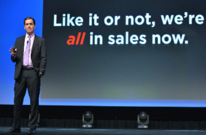 Daniel Pink, To Sell is Human

As Daniel Pink says, we’re all in sales. Even (especially) in education.
Why should a learner click on a link that sounds boring?
Why read to the end?
[Tweet “What is the payoff for committing time to your course? Communicate this clearly.”]
If you want learners to actually go through the material you present, it needs to sound engaging and important.
- Avoid words like extra, optional, and for more information … all of which sound .. optional.
- Think about the “payoff” and weave it in to your headings. Sell it!
- Learn how to write for the web.
- This also counts for your Topic headings:

Think of your material as a product you want the learner to buy, rather than a gift you are bestowing upon them. Anything that sounds interesting, fun, or presents a real world problem is bound to capture their interest.
12. Create a welcome video
So you’ve supercharged your course, adding playful and engaging design … cutting back on the text blocks. Now, there’s just one more thing to add. You.
The most important relationship building piece you can add to a course is YOU, introducing it.
- What is the course about?
- How does the course unfold as they go through it?
- What should they do if they have problems?
- Why are you excited about teaching it?
- Who are you??
Here is an example of an “About me” page. It’s the same idea (and would also work in place of a video).

Beginner’s Tip: Creating a welcome video can be as simple as screencasting the course and talking students through it. I recommend a combination of a few powerpoint slides, a screencast of the actual course, and a webcam on you talking. Then, combine these into an Animoto video. Embed the video in a “page” at the top of the course.
More advanced: Here is an article explaining how to create a more sophisticated “About me” page. Substitute “online course” for the About Me sections and you can use the advice to create a wonderful introduction to the course.
The Take Away
So there you have it … 12 hacks to supercharge your Moodle courses. Hope you found the information helpful!
What did you think? Am I missing something on the list?
Drop me a note in the comments below!
Just read your article and another cool compressor is Grid. It turns your course topics into a grid that you can apply graphics to. Clicking on the grid opens the topics without leaving the page. The other things look amazing and I’ll include some of them in future development.
Hi Craig! I haven’t worked with Grid although it sounds a bit like Pinterest tiles? I’ll have to check it out. Thanks for the comment. 🙂
[…] Read Neela Bell’s article for details on each of her tips and many useful links, and check her blog for inspiring ideas on e-learning engagement. […]